Animations and Layout (CSS)
Documentation | Webpages | Animations and Layout
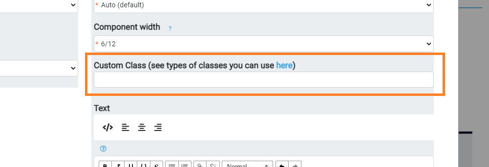
Every component you add to a website has a field called Custom Class. You can use this to do a range of inbuild animations and spacing.
Underlying Mition is Bootstrap 4, a powerful browser based layout system. So all the Bootstrap 4 features are available to you.
You can also add custom animations and classes using a Javascript component, then use that class on multiple components.
On scroll Animations
Use these classes to get an animation on scroll (as the user scrolls down and the component comes into view these animations are triggered). We use animate-hide to make the initial state of the control hidden, its optional but it makes the effect nicer.
animate-hide animate-fading
animate-hide animate-opacity
animate-hide animate-top
animate-hide animate-left
animate-hide animate-right
animate-hide animate-bottom
animate-hide animate-zoom
These classes are triggered interally, so you cannot just add these styles within a WYSIWYG, they are only valid for components and the Custom Class property.
Animations on page load
There are numerous animations available from this plugin that is available (this is already available to every page).
These animations run on page load not on scroll, but there are many of them.
Similar to Bootstrap classes, try these animation classes.
animate__animated animate__shakeY
The component will shake
animate__animated animate__fadeInDownBig
The component will make a grand entrance
animate__animated animate__bounce animate__delay-2s
The component will bounce, but will wait for 2 seconds first
You can add delay with a mix of any animation.
animate__delay-1s
animate__delay-2s
animate__delay-3s
animate__delay-4s
animate__delay-5s
This can create a nice effect on a hero to slide items in.
You can add these styles within a WYSIWYG and they will also work.
Hero 2.0
In the Description field of a Hero 2.0 if you put two .. (two full stops) this triggers auto typing code.
If you add an image manually in the HTML Text (via source code) you can also use the class img-fluid floating to make that image hover.
<img class='img-fluid floating' src='https://mition.blob.core.windows.net/mition/PRODUCTION/media/2021-Logo.png' />
You can use the class img-fluid floating on any image anywhere and it will hover.
Layout
Bootstrap uses a 12 column grid system, so when you create a component size-6 it will take up half of the screen. But sometimes you want to centre it, or not have something to the left and make it sit right. So for flexibility, use these CSS Bootstrap classes in the Custom Class field of any component to change the alignment, padding, margin and other effects.
mx-auto margin auto both left and right
my auto margin auto both top and bottom
ml-auto margin left auto
mr-auto margin right auto use this with the above one to centre a box in the screen
offset-md-2 this will offset the container so you don’t have to put a filler box before it, as we discussed. This one is a size 2 – replace 2 with any value between 1 and 11.
See here for more details on bootstrap classes.
(note: you can use more than one custom class on the component).
Warning: Increasing Margin will make the component bigger than its size, so it might not fit in the 12 grid as you would like. E.g. you have 3 x size 4 components which all sit on one row, if you add m-4 to one of those, all of a sudden one of those components is too big and it pushes the control across 2 rows.
Spacing
You can adjust the spacing for different devices too, Bootstrap uses S, XS, M and L to differentiate the device and what to do. This Bootstrap spacing documentation is very useful to understand how it works
Images
The image and most of the web components for image card / icon card have the ability to set max height and manage image cover.
Use these custom CSS classes on the webpage component.
These will set the min/max height:
height100
height110
height120
height130
height140
height150
height160
height200
height250
height300
height350
height400
height450
height500
height550
height600
height650
height700
height750
This will make the image stretch to fill in all space
object-fit-cover
Then use these to zoom in left/right/top or bottom
object-fit-cover-left
object-fit-cover-right
object-fit-cover-top
object-fit-cover-bottom
This will make the image fit whole within the space
object-fit-contain
Some samples of images and containment can be found below.
Other useful classes for webpage components for mition portals:
hidden-iOSApp
If you add this to a web component, this class will hide a component from anyone using the APP version of the website. Sometimes it is necessary to hide content from the Apple Store in order to be compliant.
If you add the same class to a webpage, it will prevent that page from being displayed on the iOS APP version of the website.
container-middle
This class used at the page setting level, will ensure your page will not exceed medium size screen - for large screens it will contain the website within pillars and keep the content looking better rather than extra large. But it does allow hero and footer items to still remain full screen.
You can override certain objects with web page component classes of container-middle (which will ensure things such as a hero or footer are placed within the container and not outside of it) with the class on the webpage component called after-container and before-container.
wholesite
This is a class you can use on a webpage component from the homepage, if this class is present, this web component is added to every other page, just like the footer is added when you use the page setting to use footer (Include default footer).


